How to Build a Lead Generation Landing Page That Actually Converts
—
11 February 2025
- How-to Guide

What is a Lead Generation Landing Page?
A lead generation landing page (also known as a “squeeze” page) is a focused, high-converting page designed to collect a visitor’s email address. It does this by offering something valuable, like an ebook, cheat sheet, or exclusive webinar, in exchange for their contact details.
But capturing an email is just the beginning. A well designed landing page sets the stage for building trust and engagement. Once a lead enters your funnel, you can nurture the relationship with helpful content, educate them on your products or services, and ultimately guide them toward making a purchase.
How Do You Measure a Landing Page’s Success?
You might be wondering, “What’s a good conversion rate for my landing page?” According to Hostinger, the average landing page conversion rate across all industries is 4.3%.
But don’t rely too heavily on that figure, conversion rates can vary widely between industries. Different sectors cater to distinct audiences with unique needs, behaviors, and buying power. For instance, the media and entertainment industry sees an average conversion rate of 18.1%.
For more insights, check out this detailed report by Unbounce.
What Types of Lead Generation Landing Pages Convert Best?
When it comes to lead generation landing pages, there’s no shortage of options, whether you’re offering an ebook, a giveaway, or a free quote. The most important factor is choosing an offer that speaks to the specific needs and interests of your audience. However, not all offers are created equal, and some are proven to deliver better conversion rates than others.
To help you refine your strategy, here’s a breakdown of the top ten types of lead generation landing pages, courtesy of LeadPages. Along with their average conversion rates, this will give you insight into which options are most effective in driving results.
- Cheat Sheet: 34%
- Checklist: 27%
- eBook: 24%
- Mini-Course: 22%
- Coupon: 20%
- Quiz: 18%
- Webinar: 17%
- Template: 15%
- Case Study: 12%
- Free Consultation: 9%
What Makes a Lead Generation Page Successful?
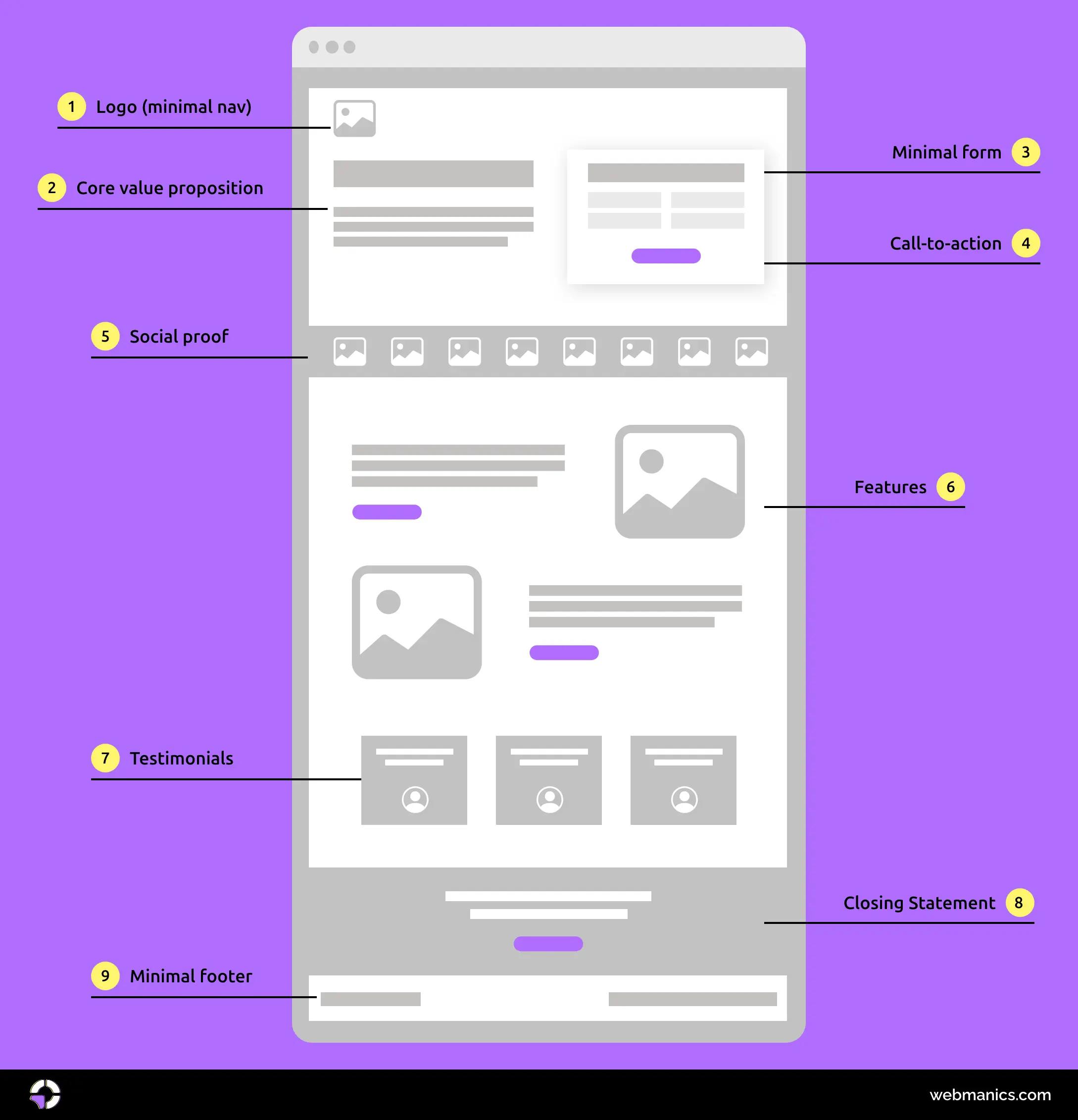
A well-structured lead generation page guides visitors seamlessly toward taking action. It combines clear messaging, persuasive design, and strategic elements to maximise conversions. Below is a visual breakdown of what an effective lead generation page looks like.

Now, let’s take a closer look at why this design is optimised for maximum conversions.
8 Landing Page Optimisation Best Practices
1. Distraction-Free Design
The primary goal of a lead generation landing page is to drive conversions, which means every element on the page should serve a clear purpose. If something doesn’t support that goal, it doesn’t belong.
One of the most effective ways to keep visitors focused is by eliminating distractions. This includes removing unnecessary navigation links, pop-ups, and any clutter that might pull attention away from the main action. A streamlined, visually clean layout ensures that visitors stay engaged and are guided smoothly toward converting.
2. Prioritise Above-the-Fold Content
“Above the fold” refers to the portion of a page that’s visible without scrolling, making it prime real estate for capturing attention and driving conversions. This section shapes a visitor’s first impression, influences their decision to stay, and sets the stage for engagement.

A high-converting page makes its value proposition instantly clear with a compelling headline, a persuasive subheading, and a strong call-to-action. A clean, distraction-free design, paired with engaging visuals like a product mockup or short explainer video, helps communicate value quickly.
Research from the Nielsen Norman Group shows that above-the-fold content captures 57% of users’ viewing time, a significant share given the brief window to grab their attention. This initial engagement is crucial, as it shapes the user’s experience and influences their next steps on the site.
In the example above, we have the core value proposition, the form, and social proof set above the fold. Giving the visitor immediate access to these key elements ensures that they can quickly understand the offer, take action, and feel confident in their decision through visible trust signals.
3. Streamline and Optimise Your Form Fields
Long forms can be a conversion killer. Only ask for essential information, name and email are often enough. If more details are needed, break the form into steps to make it feel less overwhelming. Simple, frictionless forms lead to higher submission rates.
In addition, numerous eye-tracking studies, including this one, have demonstrated that single-column forms are significantly more user-friendly, resulting in improved usability and enhanced optimisation for conversions.

Learn more on why multi-column layouts are best avoided in this UX study.
4. Social Proof
Social proof has long been a powerful tool in marketing, whether through email campaigns, SEO, or pop-ups and landing pages are no exception.
People are more likely to take action when they see that others have already benefited from an offer. Testimonials from satisfied customers build trust, especially when they include real names, photos, and company details. Trust badges, like security certifications or media mentions, enhance credibility by showing that your brand is recognised and reputable. Highlighting impactful numbers, such as “Trusted by 100+ marketers” creates a sense of authority and reliability.
POSist, a leading SaaS company, tested adding social proof to their landing page and saw a 5% increase in conversions. This demonstrates how effective it can be in turning visitors into customers.
5. Strong, Benefit-Driven Copy
Your messaging should focus on what the visitor will gain. Instead of “Download Our Ebook,” try “Get Expert Insights to Double Your Leads.” Speak directly to your audience’s pain points and how your offer solves them. Use clear, concise language that makes the value of your offer impossible to ignore.
6. Clear and Compelling CTAs
Your call-to-action (CTA) should be clear, compelling, and easy to understand. Use action-oriented phrases like “Get Your Free Guide” or “Start My Free Trial” instead of vague options like “Submit” or “Click Here.” By simplifying the process for visitors to take action, you can boost conversions and drive better business results. Check out the example below for inspiration:

On my Book a Demo landing page (available for purchase in my store), we’ve strategically placed actionable CTAs throughout the page, each linking back to the form. This ensures that no matter where the user is in their journey, the CTA, representing the primary purpose of the landing page, remains easily accessible.
7. Mobile Optimisation
As of 2024, Statista reports that 61.85% of all website traffic comes from mobile devices. With advancements in hardware and the variety of available screen sizes, it’s crucial to ensure that your landing page remains functional as screen widths adjust. This is particularly important if you’re running marketing campaigns that direct users to a landing page via email, as a large portion of email traffic is opened on mobile devices. As a result, your landing page must be optimised for mobile to provide a seamless experience.
“As page load time goes from one second to 10 seconds, the probability of a mobile site visitor bouncing increases 123%.” – Think with Google
In fact, studies show that 53% of mobile visitors will abandon a site if it takes longer than 3 seconds to load. To enhance usability and boost conversions, use a mobile-friendly design with large, easy-to-tap buttons, and minimise large chunks of text. Mobile optimisation isn’t just a design choice—it’s a necessity for keeping visitors engaged and driving conversions.
For more insights, check out my guide on creating and maintaining a technically sound landing page.
8. High-Quality Visuals
People process visuals 60,000 times faster than text, making them an incredibly powerful tool for capturing attention and conveying information quickly. To maximise engagement, incorporate relevant images, icons, or even a short explainer video that aligns with your message and enhances the user’s understanding of your offer. Visuals can break up text, making the content more digestible and appealing, while also reinforcing the key points you want to highlight.
However, it’s important to ensure that these images are not only high-quality but also optimised for web use. Large, uncompressed files can significantly slow down your page’s load time, leading to higher bounce rates. In fact, research shows that even a one-second delay in load time can result in a 7% decrease in conversions. So, prioritise images that are both visually appealing and lightweight, ensuring a seamless and fast user experience across all devices.
Book a Demo Landing Page
Discover my ready-made, ACF-built WordPress demo landing page. Easy to install, integrate with your brand, and proven to boost conversions.
Animated Product Landing Page
Explore my GSAP-powered animated product landing page. Designed for an engaging user journey, it’s easy to integrate and highlights your core value proposition.
Conclusion
By applying the strategies and best practices outlined in this article, you’ll be well on your way to creating landing pages that not only engage visitors but also drive real conversions. Keep in mind that the digital landscape is always evolving, so staying ahead of emerging trends is crucial. As interactive content continues to gain momentum, incorporating dynamic elements into your landing pages will further enhance user engagement and increase your chances of success. To help you stay informed, check out my article on the top trends to watch in 2025.
Remember that continuous optimisation is key. A successful lead generation landing page isn’t a one-and-done effort, it’s an ongoing process of testing, tweaking, and refining. Regularly monitor user behaviour and conduct A/B testing to see which elements, headlines, CTAs, images, resonate most with your audience. A/B testing allows you to make data-driven decisions, improving performance over time and ensuring that your landing page is always at its best.
Before making changes, assess the performance of your current landing page. Look at metrics like bounce rates, time on page, conversion rates, and heatmaps (tools such as Microsoft Clarity and HotJar) to understand how users are interacting with your content. This will help you identify problem areas and focus your testing on the elements that need the most attention.
Lastly, always keep the user experience at the forefront. A smooth, intuitive experience will ensure visitors stay engaged and are more likely to complete the desired action. By focusing on user-centric design, responsive layouts, fast load times, and clear CTAs, you’ll create landing pages that not only capture attention but also drive long-term results for your business.