B2B homepage CTA strategies that drive conversions


Key insights
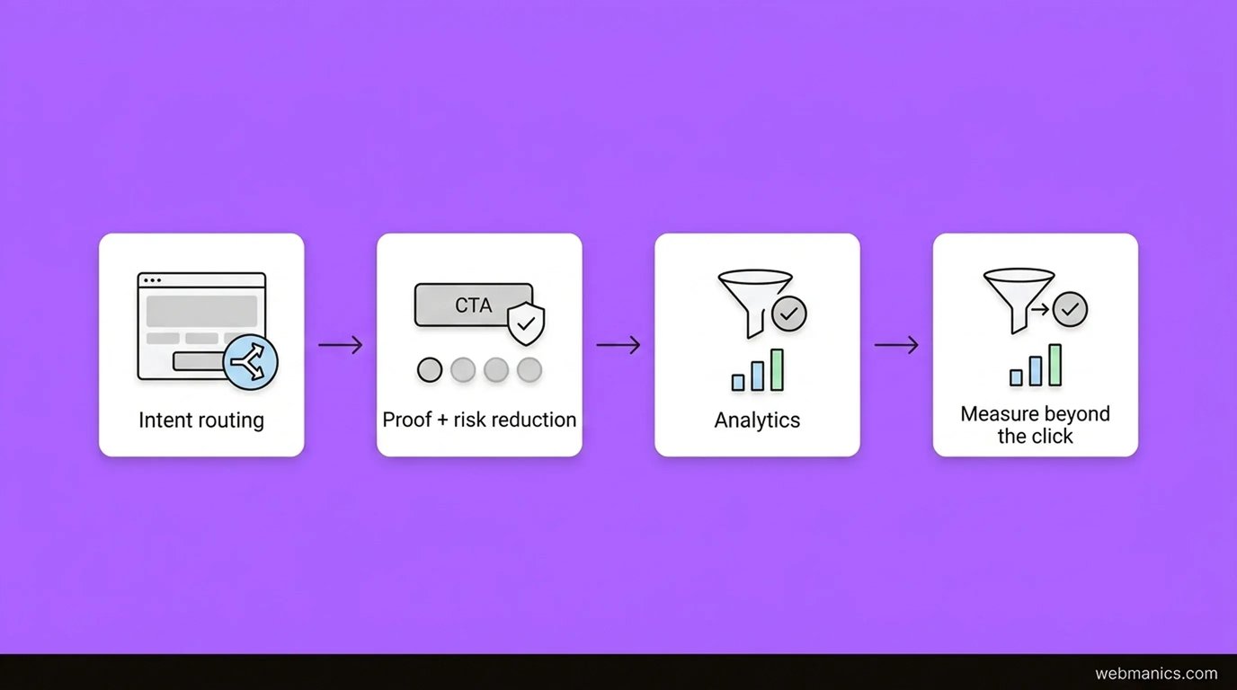
- A B2B homepage CTA is not “button copy”. It’s a routing decision: which next step matches the visitor’s intent and your sales motion.
- If your CTA underperforms, the fix is usually promise + proof + friction, not colour. Start by diagnosing those three.
- Measure CTA performance past the click: CTA click → form start → form submit → qualified lead → pipeline. CTR alone is a vanity metric.
- “Best practice” CTA advice often fails in B2B because it ignores buying committees, risk, and self-serve evaluation.
- Your homepage can support multiple CTAs, but it must have one primary outcome and a clear hierarchy.
Your homepage CTA is often the first direct request you make to a new visitor. For B2B services, that request sits inside a longer journey: multiple stakeholders, higher perceived risk, and a lot of self-serve evaluation before anyone talks to sales.
This post answers the practical questions senior teams ask when a B2B homepage CTA isn’t doing its job: what to offer, where to place it, how to reduce risk, and how to measure whether you’re actually improving lead quality.
This is part of our broader guide to Homepage optimisation for B2B: turning visitors into leads.
What a B2B homepage CTA is really for
A homepage CTA has one job: move the right person to the next best step.
That “next best step” depends on intent. In B2B, homepage visitors are rarely uniform. You usually have a mix:
- high-intent visitors (brand search, referrals)
- mid-intent visitors (problem-aware, comparing vendors)
- low-intent visitors (curious, researching)
If you treat all of them like “book a demo now”, your CTA will feel pushy to most visitors and you’ll bleed the ones who need proof first.
The 5 diagnostic questions (answer these before you rewrite a CTA)
If you only take one thing from this post, use this diagnostic. It’s the fastest way to move from generic advice to senior decision-making.
1) What intent is arriving on the homepage?
Answer this by channel. Don’t guess.
- Brand + referral traffic often has higher intent. A stronger CTA can work.
- Organic non-brand is usually earlier-stage. A lower-friction CTA often wins.
- Paid depends on targeting and landing intent. Many “homepage CTA problems” are really “wrong destination for the ad”.
Practical check
- In GA4, segment homepage sessions by channel/source and compare CTA click rate and downstream conversion.
2) What risk are you asking the visitor to take?
Every CTA is a risk trade-off. Common B2B risks:
- time cost (“book a call” feels like commitment)
- reputational cost (“will I look silly sending this to my boss?”)
- privacy cost (“will I get spammed?”)
- internal politics (“I can’t buy this alone”)
If the CTA asks for a high-risk action, you need stronger proof and clearer expectations right next to it.
3) Is your CTA an offer, or just a verb?
Many homepages ship CTAs like “Book a call” or “Get started” and assume that’s an offer.
A senior CTA includes an outcome:
- “Request a conversion audit”
- “Get a homepage teardown”
- “See pricing approach”
- “View case studies”
The verb is the mechanism. The offer is what makes it worth doing.
4) What proof is adjacent to the ask?
If the CTA is above the fold, the proof should be above the fold too.
Proof options that work well for B2B:
- logos (even a small row helps)
- one strong testimonial snippet
- a single quantified outcome (only if you can substantiate it)
- credibility signals (experience, certifications, regulated sector familiarity)
If proof is “somewhere lower”, many visitors never see it.
5) Can you measure success past the click?
You don’t optimise a CTA. You optimise a conversion path.
At minimum, define and measure:
- CTA click
- landing/form view
- form start
- form submit
- qualified lead (MQL/SQL)
- pipeline created (or booked call that shows up)
If you can’t measure lead quality, you’ll optimise for junk conversions.
Choosing the right B2B homepage CTA (high, mid, and low intent)
A practical way to design CTA hierarchy is to map offers to intent.
High intent (Decision)
Use this when a meaningful share of homepage traffic is brand/referral and ready to talk.
Good options:
- “Book a call”
- “Request proposal”
- “Talk to an expert”
Make the expectation explicit:
- “30-minute call”
- “No hard pitch”
- “We’ll review your site first”
Mid intent (Consideration)
This is where most B2B homepage traffic sits.
Good options:
- “View case studies”
- “See our process”
- “Get a homepage teardown”
- “Request an audit”
These CTAs let visitors self-qualify and build confidence before a sales conversation.
Low intent (Awareness)
Use this when the homepage gets a lot of non-brand organic or broad paid traffic.
Good options:
- “Read the guide”
- “Download checklist”
- “Watch a 3-minute walkthrough”
Important: don’t treat low-intent CTAs as “email capture at all costs”. If it doesn’t support your primary outcome, it’s a distraction.
CTA copy that works in B2B (and when it doesn’t)
Copy matters, but only after the diagnostics above.
First-person phrasing
First-person CTAs can help (“Start my trial”), but treat it as a hypothesis, not gospel. It works best when:
- the action is genuinely low risk
- the value is clear
- the visitor is already primed by the page promise
Specific beats clever
If a visitor can’t predict what happens after clicking, you will lose clicks.
Prefer:
- “Get a free audit”
- “View case studies”
- “See pricing approach”
Avoid:
- “Learn more” (unless it routes to a clearly relevant page)
- vague “Get started” CTAs that don’t match a B2B evaluation flow
Where to place CTAs on a B2B homepage (without clutter)
You’re optimising discoverability, not just aesthetics.
A practical placement pattern:
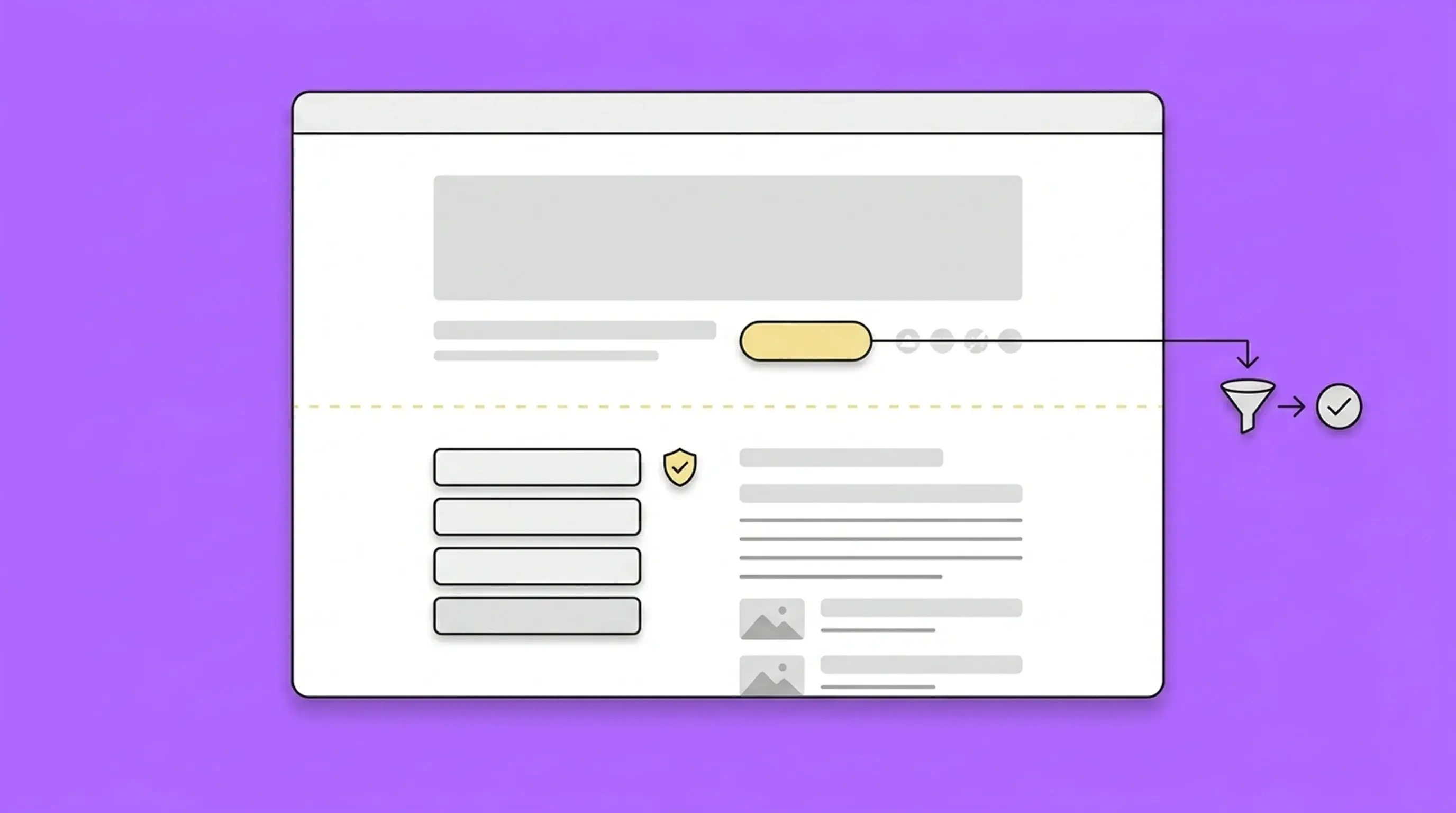
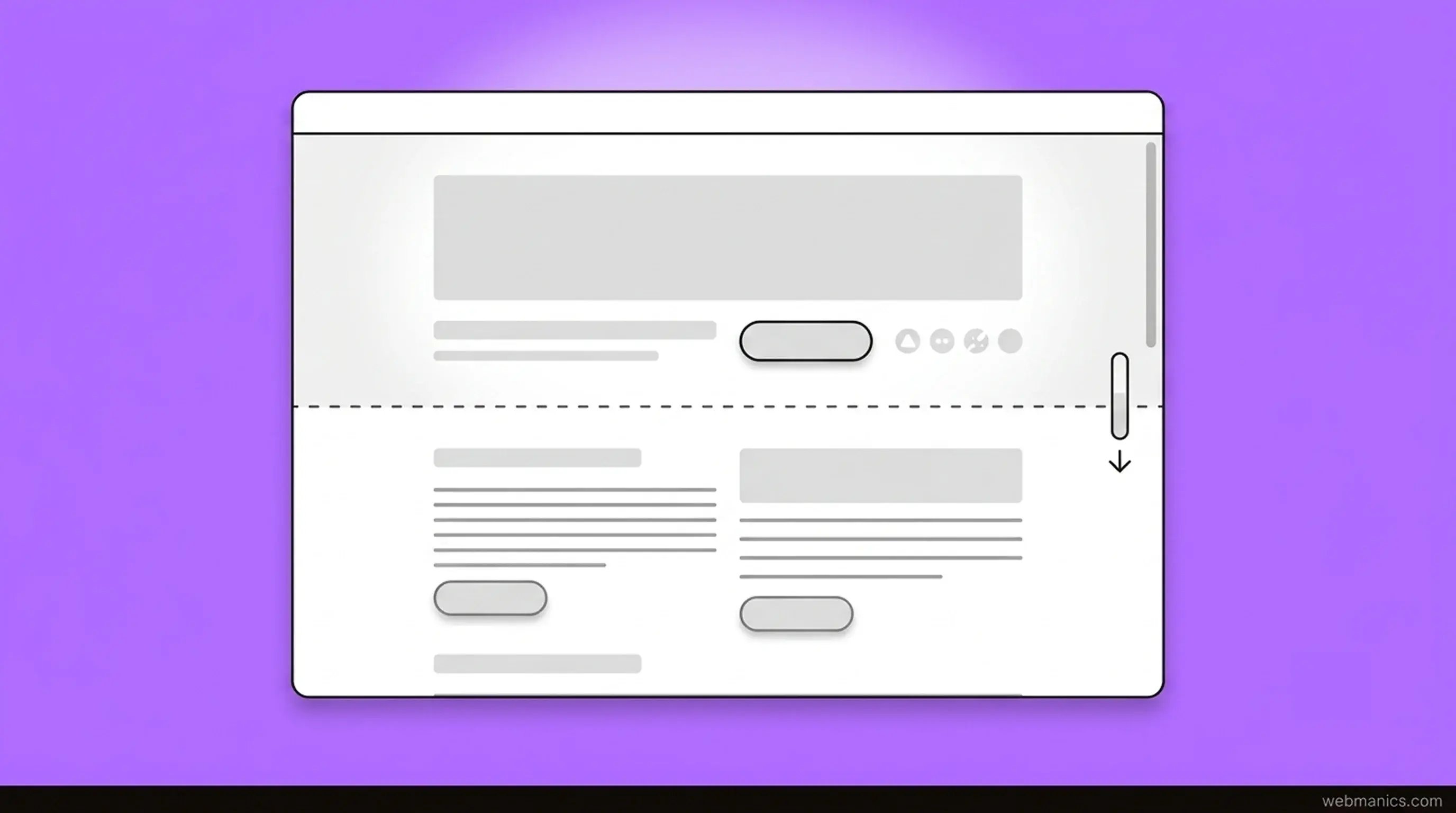
- Top (above fold): primary CTA + adjacent proof
- After key proof block: repeat primary CTA
- Bottom: final CTA with risk-reversal microcopy
If your homepage is long, repeating the CTA is usually correct. If the CTA competes with other high-level actions, it becomes noise.
Trust signals and microcopy (risk reversal)
B2B buyers default to skepticism. A small line of microcopy can remove a lot of friction.
Examples:
- “No spam. One email per month.”
- “No sales deck. Just a teardown and next steps.”
- “No contract. Cancel anytime.” (only if true)
Keep it short. Put it next to the CTA, not in a footer.
Mobile UX: the hidden CTA conversion leak
Even in B2B, many first visits happen on mobile. Common failure modes:
- sticky headers covering the CTA
- buttons too small to tap confidently
- forms that are painful on mobile
- slow load that delays first interaction
If you haven’t tested your homepage CTA experience on a mid-range phone, you’re guessing.
How to measure and test a B2B homepage CTA (without fooling yourself)
A/B testing is only useful if you can trust the measurement.
What to test first (high leverage)
- Page promise above the fold (headline + subhead)
- Proof placement (logos/testimonial/stat)
- CTA offer (audit vs call vs case studies)
- CTA copy (specific phrasing)
- Form friction (fields, error handling, speed)
What to measure
Track outcomes, not clicks:
- conversion to qualified lead
- booked calls that show up and match ICP
- pipeline influenced
If your test only improves CTR but reduces lead quality, it’s a loss.
A simple CTA checklist (senior version)
Use this as a final QA pass.
- The page promise is clear in one sentence.
- The CTA offer matches the visitor’s likely intent.
- Proof is adjacent to the CTA.
- Risk-reversal microcopy is present (and true).
- The CTA is easy to tap and see on mobile.
- Tracking is set up from click → lead quality.
- There is one primary outcome and a clear CTA hierarchy.
Conclusion: treat the CTA as a routing decision
If you want a homepage CTA that performs in B2B, stop thinking about buttons and start thinking about routing: intent, risk, proof, friction, and measurement.
If you can answer the five diagnostic questions above, you’ll know exactly what to change, and you’ll be able to prove whether it worked.
If you’re working through a full homepage optimisation project (measurement, first impressions, mobile UX, and testing cadence), start here: Homepage optimisation for B2B: turning visitors into leads.
Want a senior-led audit of your B2B homepage CTA?
If you want a clear answer to what to change first (and how to measure whether it worked), request a website conversion audit. You’ll get a baseline view of intent, friction, and drop-offs, plus specific CTA + proof + routing recommendations (not generic best practice) and a prioritised list of fixes and tests to run next.