Social proof examples for B2B websites: what goes where


The most useful social proof examples for a B2B homepage are client logos, named testimonials, case study results, review scores, and certifications. Each one works best when it sits next to the claim it supports, not in a separate section at the bottom.
Picture a finance director opening your homepage ten minutes before a shortlist call. They are checking whether you are safe to recommend, and your proof has to answer that fast. This guide shows 9 social proof examples that work on a B2B homepage. It compares them by effort and trust, maps where each one belongs, and covers what to do when you have little proof yet. You will finish with a placement plan you can apply to your own homepage this week.
What B2B social proof has to prove
Social proof is evidence that other people have chosen you and were glad they did. In consumer buying, it mostly reassures one person. B2B social proof has a harder job: it has to reassure a group, most of whom never speak to you.
Forrester's State of Business Buying 2026 puts the typical buying decision at 22 people: 13 internal stakeholders and 9 external influencers. Most of those people will judge you through self-directed research, and your homepage is a large part of it.
That research reaches beyond your own site. TrustRadius found that 54% of tech buyers spoke to an existing user before purchasing, yet only 23% spoke to a reference the vendor supplied. Buyers are verifying your claims in private, through peers and communities.
So B2B social proof needs to do three things:
- Show fit. Prove you have worked with companies like theirs, at their size, with their problem.
- Show outcomes. Name the result, with a number, a timeframe, or both.
- Survive checking. Every logo, name, and figure should hold up if a buyer looks it up.
9 social proof examples that work on a B2B homepage
In our assessment, these social proof examples carry trust for a B2B buyer in roughly this order, from highest to lowest.
- Outcome-led case study snippets. A one-line result, such as a lift in demo requests over a named period, linked to the full story. This is the strongest form because it shows a measurable change.
- Named testimonials with role and company. A quote from a named person, with photo, job title, and company, that describes a specific problem solved.
- Client logos from recognisable brands. A strip of six to eight logos near the top of the page. Logos signal fit at a glance, so choose ones your target buyers will know.
- Third-party review scores. Ratings from platforms such as G2, Clutch, or Google, shown with the number of reviews. Independent scores carry more weight than self-published praise.
- Certifications and standards. Badges such as ISO 27001 or Cyber Essentials answer security and procurement questions before they are asked.
- Customer numbers. A clear count, such as the number of teams or projects delivered. This is often called 'wisdom of the crowd' proof.
- Media mentions. Logos of publications that have covered your work, linked to the article where possible.
- Partner and integration badges. Official partner status with platforms your buyers already use, such as HubSpot or Salesforce.
- Expert endorsements. A quote from a recognised figure in your industry who has used or reviewed your work.
Two rules apply to every item on this list. First, each piece of proof should name a real person, company, or source that a buyer could check. Second, it should sit close to the claim it supports. A logo strip under the hero supports 'we work with companies like you'. A result beside a service supports 'this service works'.
If you can only add three of these today, start with logos, one named testimonial, and one outcome snippet. Together they cover fit, experience, and results, which are the three questions most buying groups ask first.
Types of social proof compared by trust and effort
Not every type of social proof is worth the same effort. The table below compares the main types of social proof by what they prove to a buyer and how hard they are to collect.
| Type | What it proves | Effort to collect | Best homepage position |
|---|---|---|---|
| Case study snippet | Measurable outcome | High | Next to the main service claim |
| Named testimonial | Specific problem solved | Medium | Beside the CTA or form |
| Client logos | Fit with known brands | Low | Directly below the hero |
| Review scores | Independent satisfaction | Medium | Near pricing or the CTA |
| Certifications | Security and compliance | Medium | Footer and near forms |
| Customer numbers | Scale and adoption | Low | Hero or subheading |
Start with the low-effort types if your homepage has none today. Then invest in case study snippets, because they are the only type that shows a result rather than a reputation.
Where to place trust signals on the page
Trust signals are any elements that reduce the risk a buyer feels before acting. Placement matters as much as the proof itself, because proof only works when it appears at the moment of doubt.
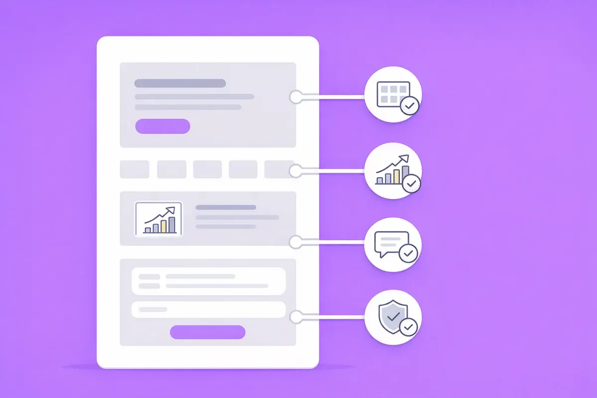
Use this placement order as a starting point:
- Below the hero. Put client logos or a customer number immediately under the main headline. This answers 'are they credible?' before a visitor scrolls.
- Beside each service claim. Pair every claim with one piece of proof, such as a result next to the service it came from.
- Next to the CTA. Place a short testimonial or review score beside the primary call to action. Our guide to B2B homepage CTA strategies covers how to write the CTA itself.
- Beside the form. Add a certification badge and a one-line privacy reassurance close to any enquiry form.
Check the order on mobile as well. Most homepages stack into a single column on a phone, which can push logos and testimonials far below the first screen. Keep at least one trust signal within the first scroll on mobile, and make sure logos stay legible at small sizes.
For a wider view of homepage structure, read our guide to homepage optimisation for B2B. The same placement logic applies to campaign pages, as our lead gen landing page checklist shows.
Social proof marketing mistakes that cost enquiries
Social proof marketing fails when it looks generic or cannot be verified. Buyers have learned to distrust praise, and they know fake reviews exist. Vague proof now reads as a warning sign.
Common mistakes on B2B homepages include:
- Anonymous testimonials. A quote signed 'Marketing Director, SaaS company' proves very little. Use a full name and company, with written consent.
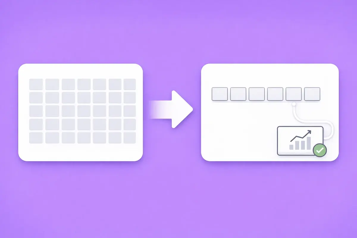
- Logo walls without context. Thirty logos in a grid look like decoration. Six relevant logos with one linked result do more work.
- Outdated proof. A five-year-old testimonial, or a logo from a client who has since left, can be checked and found wanting.
- Praise without a problem. 'Great to work with' tells a buyer nothing. Proof should name the problem and the change.
- Proof in the wrong place. A testimonials page that nobody visits does less than one quote beside the form.
- Proof that does not match the buyer. Enterprise logos can put off a small business buyer, and the reverse is also true. Show proof from companies that look like the visitor you want.
How to build social proof when you have little yet
Early-stage companies often have no case studies and few named clients. You can still show evidence without inventing it.
Start with what is true and checkable:
- Describe the problem type and method. Without a named client, describe the work honestly, such as 'a UK B2B software client with a broken demo funnel'. Then explain what you changed.
- Show credentials. Certifications, partner status, and years of relevant experience are factual and verifiable.
- Use process proof. Show your audit checklist, sprint plan, or reporting format. Buyers trust a visible method.
- Collect consented quotes early. Ask satisfied clients for permission to use a short quote with their name and role.
- Share numbers you can stand behind. Projects delivered, years in the field, or average response time are all real proof if they are accurate and current.
Never name a client or publish their results without written consent. If you want an outside view of what your homepage is missing, a website conversion audit is a quick way to find the gaps.
How to measure whether your social proof works
Social proof is a hypothesis until you measure it. Adding a testimonial feels safe, but it can also push your CTA down the page or distract from the offer.
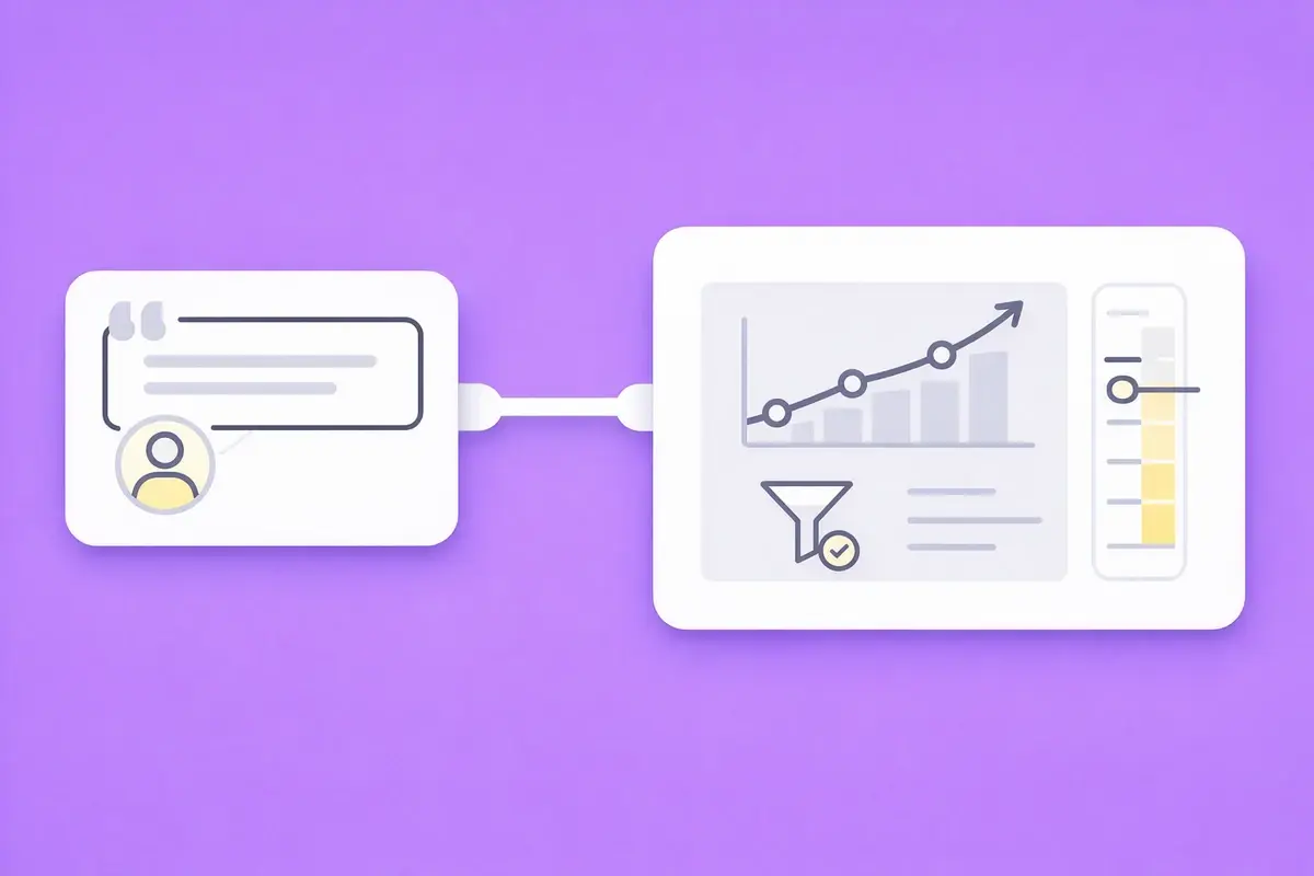
Track these signals before and after any change:
- Enquiry conversion rate. The share of homepage visitors who submit a form or book a call. This is the number that matters most.
- CTA click-through rate. How many visitors click the primary call to action. Proof beside the CTA should lift this first.
- Scroll depth to proof. Whether visitors actually reach the section where your proof sits. Proof below the point most people stop scrolling does no work.
- Form starts versus completions. A gap here suggests doubt at the final step, which a badge or short quote can address.
Change one placement at a time and run it for at least four weeks, or until you have enough traffic for a clear result. Heatmaps and session recordings show whether visitors look at the proof or skip it. If a placement does not move enquiries, move or replace it rather than adding more.
How AI search reads your social proof
AI search changes where buyers first meet your proof. G2's 2026 AI search report found that 51% of software buyers now start their research with an AI chatbot more often than Google.
AI answers draw on what other sites say about you, as well as on your homepage. Review platforms, partner directories, and press coverage all feed those answers. AI answers tend to cite independent sources, so proof that lives only on your own site carries less weight there.
Three practical steps help:
- Keep names consistent. Use the same company name, service names, and figures everywhere your proof appears.
- Make proof quotable. Write results as short, self-contained sentences that an AI system can lift without extra context.
- Earn third-party mentions. Reviews and partner listings give AI systems independent sources to cite.
Our AI search optimisation service covers this in more depth.
Start with one placement this week
Pick the strongest piece of proof you already have and move it next to your primary CTA. Then add logos below the hero and one outcome beside your main service claim. Measure enquiry rate for four weeks before changing anything else. Small, well-placed proof usually beats a large testimonials page that buyers never reach.
Find out what your homepage proof is missing
A WebManics conversion audit reviews where your social proof sits, which trust signals are missing, and what is costing you enquiries. You get a prioritised fix list two business days after access is in place.